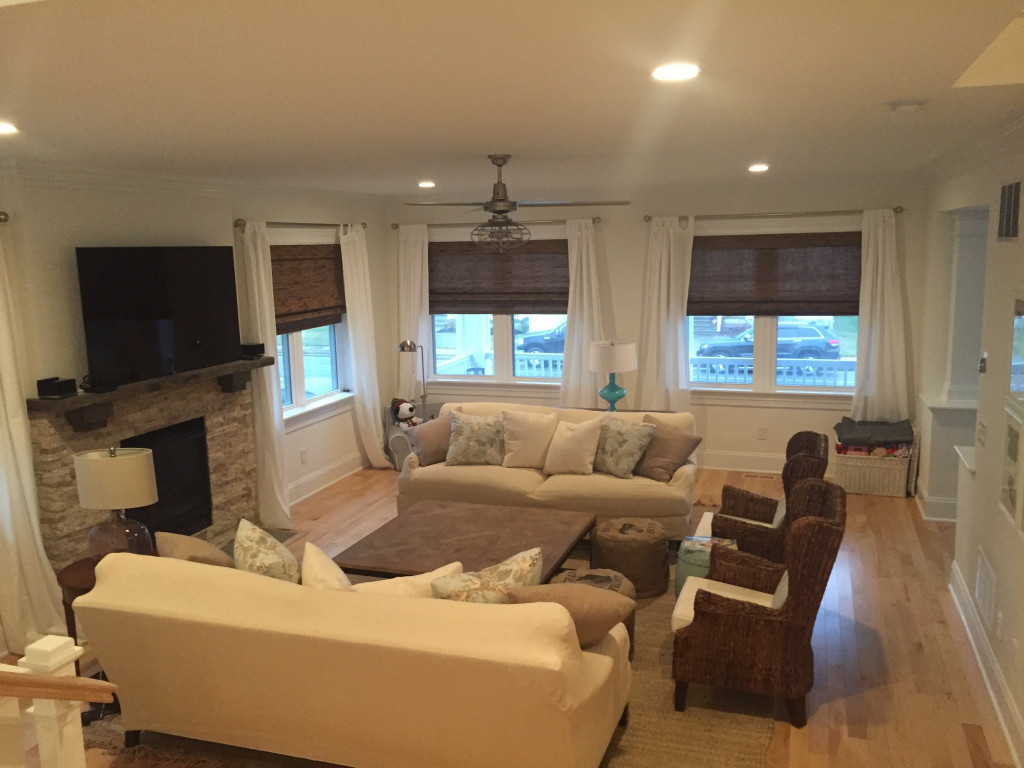
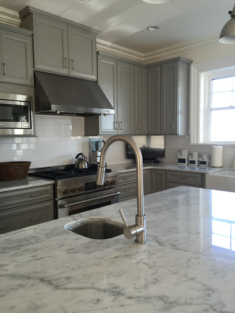
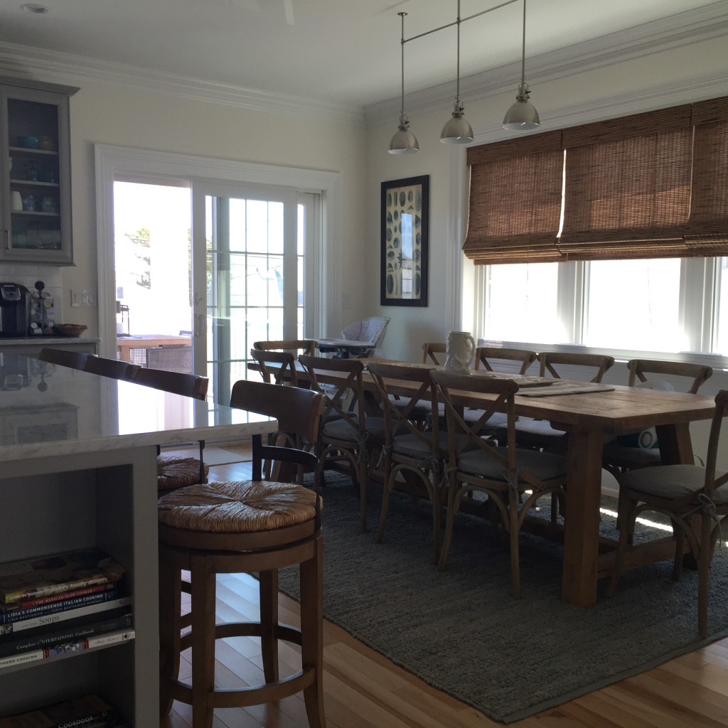
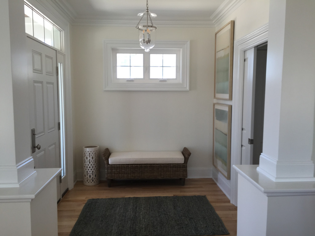
East Coast Beach House “After” Photos

Interior Design Service Online

Interior Design Service Online

Interior Design Service Online

Interior Design Service Online

Interior Design Service Online

Interior Design Service Online

Interior Design Service Online

Interior Design Service Online

Interior Design Service Online

Interior Design Service Online

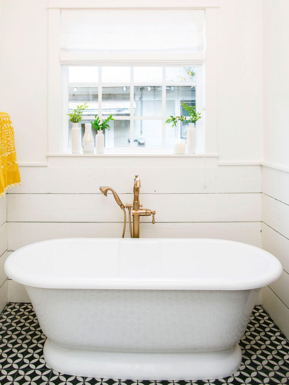
As a virtual interior designer, receiving “after” photos from a client is always a treat! Here are some recent photos of an east coast beach home I was lucky enough to design. This lovely house was a new construction project designed to be causal, calm and coastal – everything beach without the literal beach references.

More project photos to follow. Please check my blog https://www.interiordesignserviceonline.com/blog/ often for other design inspiration.

“Fixer Upper” Style

HGVT Fixer Upper

HGVT Fixer Upper

So by now most of us have heard of or better yet have been watching Fixer Upper on HGTV. The “look” is causal, comfortable, family friendly and the designs are incredibly well done. I have often been asked to create designs for clients in a “Fixer Upper” style.

Like or not, this show has created an entirely new style category. Not familiar? Here is a link to some of the Fixer Upper look design highlights:

http://www.hgtv.com/design/decorating/design-101/17-ways-to-decorate-like-the-fixer-upper-stars-pictures

Need some design help for your home? Interior Design Service Online will design your home to meet whatever style you desire. Give us a try today!

Online Interior Design Service – Texas Ranch House Design

This week, one of the many rooms I had the pleasure of designing was a Family Room for a Texas ranch house. Think long room, old fireplace, wood paneling and two exterior doors.  This space was a challenge on the furniture layout side but the decorating side was a blast!

I added warm white walls, a leather sofa, some rustic elements, fun prints and pops of color turned the space into a ranch meets updated farmhouse look.

Below are a few of my favorite selections from the design:

  1.   Area Rug

Online Interior Design Service

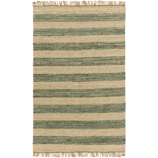
The rug is where a design usually starts for me and this room was no exception. Once I found this jute rug with teal stripes I knew exactly where the design was headed. What is not to love about this rug? Natural fiber, stripes, color, fringe and this rug from Surya happens to also be budget friendly.

2.   Throw Pillows

Online Interior Design Service

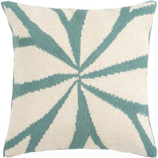
These wool and cotton throw pillows from Surya hit the right note between rustic and refined. Place on the brown leather sofa, these throw pillows added the needed color and a touch of softness.

3.   Wall Art

Online Interior Design Service

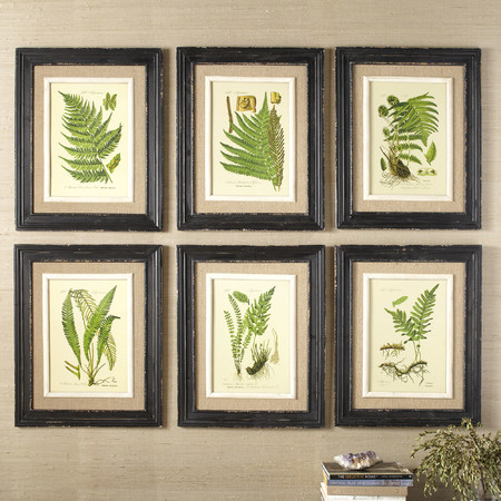
To break up the newly white painted wood paneling on the walls, we needed some great art. This set of framed botanical prints was exactly right. Try hanging a series of art near a television to break up the look of big boxes on the wall. We placed these near a television to do just that.

4.   Coffee Table

Online Interior Design Service

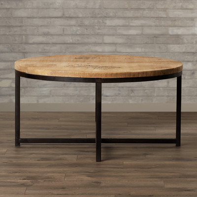
There are a lot of industrial modern style coffee tables available these days. In my online interior service design work this is something I stumble into all the time. Our selected table from Wayfair hits all the right notes – style, scale and price.

5.   Pouf Ottomans

Online Interior Design Service

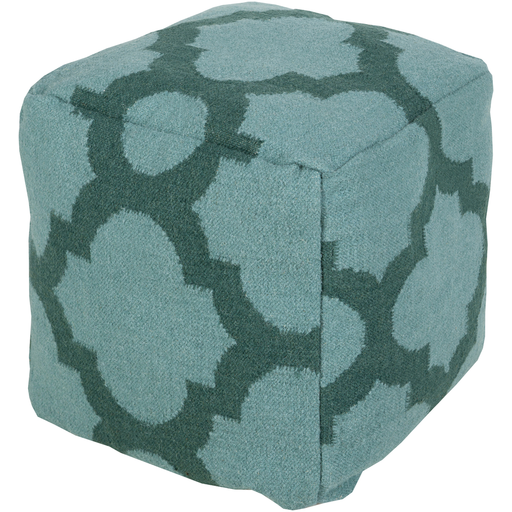
This teal and green graphic print is just what my design needed. One would not typically think modern print in a farmhouse style but sometimes mixing in the unexpended makes a design awesome.

Interested in your own room design? Visit us at Interior Design Service Online to find out how we can help you transform your very own home.

Five Tips for a Happy Home Office

Want a Home Office that makes you actually want to go to work?  Take a look at our five tips for a happy home office.

  1. Pick Your Spot

This can be the biggest challenge of all when it comes to the home office (location, location, location).  A designated room is ideal but what do you do when you don’t have the bedroom to spare?  Start thinking outside the box…perhaps you have a closet that can be cleaned out and used, an empty space at the top of your stairs or even a niche in the kitchen. 

  1. Color

Color will set the mood and tone for your office.  Perhaps you want to create a calm and peaceful feeling while you work (it can’t hurt to try, right?).  This type of environment can be created with earthy tones such as green and soft blues.  Need an office for an instant attitude pick up?  Try sunny yellows to brighten your work day.

  1. View

Consider the placement of your chair and other home office furniture.  Make sure to give yourself something interesting to look at (besides your computer screen) by placing your chair toward a window view, looking into an adjacent room or facing anything but the wall.  If you must face only a wall be sure to bring in some unique art to peek your visual interest.

  1. Accessorize

Don’t’ forget the accessories!  There is nothing like a few well chosen home accessories to complete the look of the room design and make it feel like you.   Even utilitarian items like file boxes and folders can be great looking; no need to stick with vanilla manila folders when there are some really pretty choices available.  While something like decorative folders may cost a little bit more the joy that something simple like a striped folder can bring your daily life can be well worth the few extra pennies.

  1. Function Before Form

Yes, my hope is that your office space will look great but even more importantly it that it should function well.  This means a well chosen and comfortable chair and home office furniture meets your needs.  While this may sound so basic it can be easy to overlook the importance of ergonomic comfort.

Follow the above tips for your home office design.  Perhaps, then, your work days will be as pleasant as the brief commute from your bedroom to your office.


My Favorite Way to Organize Shelves – By Color!

I was working on a Living Room design this afternoon and my client had a question about how they should layout the books and other items on a pair of bookcase.  The answer for their room – by color of course!  This might also be the answer for your house too.

And this type of design is so simple to do.  Start by pulling everything off the shelves and set items on the floor in color piles.  Don’t have enough of one color?  Start searching other rooms of your home or your sister’s house perhaps for a few other items.  Once you have your little color collections pulled together, assign a color to each shelf in the order of a rainbow.  Remember ROYGBIV from science class? (Red,Orange, Yellow, Green, Blue, Indigo, Violet).

As a highly visual person, a bookcase with no rhyme or reason to the arrangement of items makes me nuts.  This is a great spot to show a little personality and zest, and the best part is that a cool arraignment cost no more money than simply shoving items on the shelves.

The Basics of Shabby Chic Style

Image: She Know's Home and Garden

A shabby chic look is a style that naturally lends itself to decorating on a budget.  This is because the Shabby Chic look is based on using furnishings that are comfortable, time-worn, and in keeping with simple and practical living.

If you are on a limited decorating budget and want to create a look that is unpretentious yet elegant, Shabby Chic may be the style for you.  Here are a few of the basic elements that make up a Shabby Chic look that you may want to try in your own home.

Slip Covers:  Slip covered furniture is the cornerstone of a Shabby Chic interior.  Not only does slip covering furniture give an old item a new look, the cost is quite inexpensive and slip covering allows you to easily purchase used furniture.  The Shabby Chic style often uses lots of simple white slip covers that look clean and fresh and are extremely budget friendly.

Unmatched Printed Fabrics: To liven up the white slip covers, printed and patterned fabrics are added as comfortable throw pillows, chair cushions, bedding, etc.  These fabrics are often floral but can also be striped, paisley or any other type of subdued print.  These various patterns and colors creates a relaxed feel in a Shabby Chic home, and allows a budget decorator to purchase remnants to mix and match.

Painted Furniture: Painted furniture is another key element in a Shabby Chic interior.  Furniture can be purchased at flea markets and garages sales, and then painted for that old but loved look.  Adding paint to an item of furniture gives a clean appearance, and painting several items all one color (typically white in Shabby Chic) gives unmatched furniture a look of an imperfectly matched set.

Flowers: Fresh flowers add lightness and color, and an instant Chic in the home.  To achieve a Shabby Chic look with flowers, use cut flowers from the garden or make you own bouquets from flowers you purchase.  The floral arrangements are typically informal and organic, with a look of just being thrown together.  Flowers are used in all rooms of the home including the bedrooms and bathrooms.

Unique Lighting: Shabby Chic features light fixtures and lamps that typically appear to be flea market finds.  Often the light fixtures have glass or crystal beads which in juxtaposition to the casual furniture creates an unexpected look.  Lamps are often painted, and feature fabric shades made from printed fabrics.

Now that you know some of the key fundamentals that go into making a Shabby Chic look, you can try to incorporate some of these elements into your own home.  A major appeal and the beauty of a Shabby Chic look is the imperfection, so do not be afraid of making a mistake when giving this style a try.

Ten Tips for Decorating a Child’s Room


  1. Start with a theme and think outside of the box. Avoid room themes that are based on your child’s favorite character or television show because it will be difficult to design the room without having to purchase a lot of overpriced and unattractive room decor created to market specifically for kids. Instead, select a theme that is more general based on a broader interest of your child, such as a flower garden or the solar system.
  2. Allow your child to become a part of the process. Talk to you child about their specific tastes in colors and other room details. Ask them about what they would like the room to look like; perhaps they will have an idea that is lots more creative than anything you might see in a magazine or catalog.
  3. Use a great paint color but think sophisticated rather than Crayola crayon. Select a paint color that is subtle, subdued and classic. Allow the brighter colors to come from accessories and your child’s toys, these items will inevitably be brightly colored.
  4. Make it personal by incorporating your child’s name somewhere in the room. Perhaps you can stencil their name on the wall above the bed. Also, rather than spending money on store bought art work, use inexpensive plastic frames to display your child’s artwork and other creations.
  5. Remember not to strive for perfection when creating a child’s room. Nobody is perfect, including your child, and you want to keep the environment friendly and forgiving for the ongoing mess and clutter that often associated with a child’s bedroom.
  6. Make toy and clothing storage accessible to your child’s height and reach level. Be sure that your child can be successful in selecting their clothing, and be able to reach toys for play and easily put them away at pick up time.
  7. Don’t forget about the ceiling. This is another great space to add a bit of visual interest. Depending on the theme of the room, you might consider hanging fabric butterflies, beautiful planets, or other items that relate to your concept.
  8. Look for wall paper cutouts that are easily applied to the wall, and easily removed. These are a great alternative to traditional wallpaper, wallpaper borders, or murals as they go up (and down) in a matter of minutes.
  9. Think long term. When purchasing more expensive items like furniture, look for pieces that are classically designed and will grow with your child.
  10.  Keep it simple and fun. Remember those times when you child was very young and more interested in the wrapping paper rather than the actual gift. Same applies with their bedroom design. There is no need to go overboard and spend lots of money. A little effort and creativity on your part will go a long way in creating a room that you will like and your child will enjoy for many years.